
Star Trek Initial Impressions and Navigation Discovery
Usability Research to understand impressions, flows, and user wants for a robust universe
Role / UX Researcher
Methodology / Research, Usability Testing, Qualitative Analysis, Report and Presentation
Platforms / iOS, Android, Tablet, Desktop
Overview
After launching of StarTrek.com, "The Official Star Trek Website and gateway to the final frontier", we wanted to explore the first impressions of the user experience on the first iteration of the site. With plans to expand on interactive content, we wanted to revisit and focus on creating a scalable site navigation and framework to match a robust universe.
A work in progress-- The current Official StarTrek.com experience after adopting some recommendations from this research study. More to come in the pipeline.
Areas of Interest
Understand users’ initial impression of the design and pain points
Investigate how content should be consolidated and grouped
Develop a scalable IA for Star Trek as the brand grows

Star Trek site in consideration at the time of usability research.
Methodology
14 participants
-
(7 male 7 female)
-
Age: 18-45
-
Devices: desktop; none
-
Web Browsers: Any
-
Household Income: $40k+
-
Range of Familiarity with Brand
10 remote unmoderated users (15-25 min sessions)
4 in person moderated users (40-45 min sessions)
Research at a Glance
"It looks a little undone. It looks nice, but I think it could be nicer for Star Trek.” -- Male, 23
“Oh Shows and Movies… Can you watch them on here? Oh it’s the news. I was hoping I could watch maybe some of The Original Series.”
-- Female, 20
“I’m left a little bit wondering what this homepage is and what the purpose is. It seems all over the place and it’s not very focused.”
-- Male, 40
“Oh this is news? Can I go back to the beginning? Oh it still takes me there. Okay, so it starts with news. Now I understand” -- Female, 26
“Where am I? How do I get back?” and “That is annoying” -- Everyone
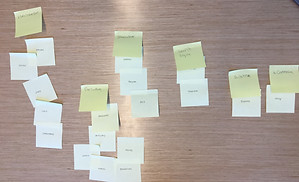
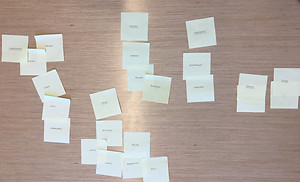
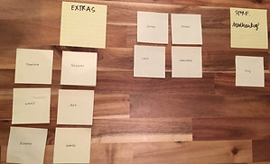
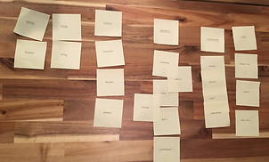
Card sorting exercise samples from the in-person moderated sessions
Insights
There were three main buckets that I used to organize insights-- bugs & QA, content, and design.
Bugs & QA
As the site had recently launched, many users' impressions were distracted by bugs. String truncation, broken images, or incorrect imagery made the site seem less official, incomplete and left more to be desired.
Content
Unsatisfactory quality and presentation of content was also a reoccurring theme. In addition to noting that the quality of images was unexpected for the brand, users longed for exclusive content to set the official site apart from any other Star Trek site. Interestingly, users both familiar and less familiar with the brand desired more context and were confused with the organization of content.
Design
Overall opinions of the site were across the spectrum. Some users praised that it looked "Star Trek-y"; however some cited that since the brand was futuristic they expected more motion and interactivity. While impressions regarding UI varied, users expressed frustration with the navigation of the site. Some templates and landing pages were too similar while one of the main user journeys caused user disorientation.
Recommendations
Bugs & QA
-
Resolve known bugs and provide high quality assets
Content
-
Define the type of content visible on each page
-
Include more context for content
-
Have direct links for exclusive content and incorporate more exclusive content such as "Behind the Scenes"
-
Change organization and navigation of information in the "Database" section
Design
-
Create distinctive templates by content type
-
Incorporate motion design and increase video presence
-
Revisit navigation items and categorization
-
Open "Shop" in new tab or link back to main site
Reflection & Next Steps
This study achieved many of the goals that we had in mind. We were able to get a baseline for user impressions, identify low hanging fruit user concerns and bug fixes, and highlight features and initiatives for the product team to address moving forward. Furthermore, feedback gathered from these sessions aided in the prioritization and validation of the direction of team efforts.
However, moving forward, additional feature focused usability sessions would be an ideal next step. Because the research was so broad, the research merely illuminated areas for growth and to do a complete feature iteration, more information would be informative. Another foundational stone to set would be comprehensive metrics tracking to further the team's understanding of user behavior and patterns.