
ETLive Mobile App Expansion
Expanding and enriching the mobile experience with new content by enabling users to access news from ET Online.
Role / UX UI Designer
Methodology / Research, Usability Testing, Wireframing, Mobile Interaction Design, Visual UI Design
Platforms / iOS, Android, Tablet
Creating a rich extension
ETLive is a video and streaming digital extension of the Entertainment Tonight property, a leading source on entertainment and celebrity news. Available on multiple platforms, this project sought out to enrich the user experience and expand the types of content available on the native mobile app on iOS and Android.
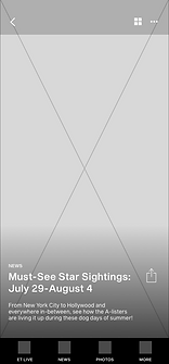
Video walkthrough for the proposed design for the ET Live mobile app on iOS
More than video news
Prior to this project, the entire ET Live mobile app consisted of only the ET Livestream and trays of videos for content on demand. While the app catered to users' video needs, they voiced that they wanted more. Answering user sentiment, the team saw this as an opportunity to expand the extent of the user experience and give users access more types of content available on sister property, ET Online.
How might we integrate user sentiment and enrich the native mobile app coverage experience?
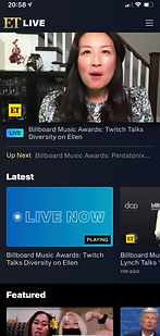
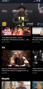
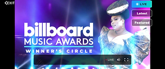
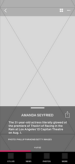
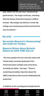
Screenshots of the ET Live native mobile app. From left to right: Landing page with ET Live player as the hero, ET Live sticky player with trays below, full screen ET Live player as user changes orientation of their device
Requirements & Constraints
-
Must be optimized for iOS and Android
-
ETLive player must be upfront and center
-
ET Live team must be able to promote playlists and specific content
-
Visuals and UI must be aligned with broadcast style guides
-
IA and new navigation must be scalable as new content is introduced
-
Non video content is created by the ET Online editorial team-- the ET Live team's main focus is video content
-
No data tracking and historical metrics for other content types besides video
Listening and engaging users
To kickoff the direction of my research, I leveraged previous research used to make improvements to the ET Online website. Since the brands have similar users and audiences, user research, user flows, empathy maps, and insights regarding navigation and content pages helped inform the design. One important insight from previous projects was that there was confusion between the ET Live and ET Online products. This insight validated our team's goal to integrate the products into a consistent experience.
The reviews of users of the current experience were an integral part of my research. After organizing sentiments into an affinity map, I was able to see that users had felt that the last update to the app was detrimental to their experience of interacting with entertainment news. It was found that users wanted a more robust experience where there would be more types of content to consume. They also found it difficult to find topic specific content and were frustrated there was not a search function.
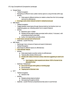
Lastly, I also researched and gleaned ideas from comparative and competitive analysis of other news and video streaming services. This research provided insights towards different presentations and organization of content as well as inspiration on how to create a scalable sitemap and navigation.
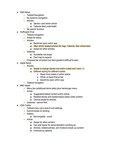


Research artifacts, notes, and user feedback which shaped and molded the mobile app expansion design
Designing for multiple content types
Once insights were gathered, I worked with product and engineering to prioritize and plan for the incremental UX improvements. Features and milestones were then assigned to the product roadmap. From our discussions, it was established we would revisit the navigation of the app and the design of the different content pages first. While working on wireframe designs, I pushed to integrate developer feedback and product input to feasibly meet business and user goals while keeping technical constraints and possibilities in mind.
After several iterations, I collaborated on designs for mobile and tablet with our UI designer and took upon the task of high fidelity UI mockups for Android and iOS developer reference.


Various wireframes and iterations of the landing, article page, and galleries pages
Reflection & Next Steps
The scope of this project was a large over taking and change for the property. Our team was successful in addressing a primary concern voiced in by users. However, our process would have benefitted from more historical data in addition to in depth interviews with users to really identify pain points. As these interviews were not possible due to time constraints, I worked with previous research and secondary research.
Once the designs were implemented the next step would be to observe and listen to the reception of users. The new user journeys introduced more much more complexity to the native app by adding a news tab flow, galleries tab flow, and settings flow. Therefore I would aim subsequent efforts towards iterating based upon user feedback and metrics tracking to massage kinks from the most recent iteration in addition to making preparations for other initiatives on the product roadmap for UX improvements such as search functionality.